
Summary
The Scheduler has great features allowing you to easily change your views, flip between favorite and dynamic searches, share views, and modify your Bookings, Orders, and Projects. This article walks you through the different ways to manipulate the appearance of Scheduler
The Scheduler has a collapsible left and right wing which allow you to either access more space on the Scheduler or more information about Projects or Orders.
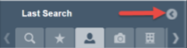
The left wing: After selecting and loading search criteria, you can collapse the left wing by clicking on the gray arrow to the right of the Last Search. This will create additional space on the Scheduler
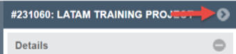
The right wing: After loading Projects or Orders into the Scheduler, you can expand the right wing to access Details and Smart Assign
You can personalize your Scheduler view by picking a specific date or time range (single day up to 48 months) and zoom in or out of your display.

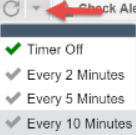
Tip: if you don’t see what you should/want to see, confirm that you have the correct dates and timeframe chosen. Click the Refresh button to reload the Scheduler. For automatic updates to the Scheduler, you can also turn on the Timer function by clicking the drop down arrow to the right of the Refresh button and selecting the frequency of automatic updates
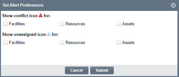
Setting alert configurations help schedulers manage Order and Booking conflicts. Alerts are located at the top of the Scheduler.
1. Click the  button at the top right hand of the menu to turn on Alerts. You can modify the Alert Preferences by clicking on the arrow next to
  and selecting Config
2. Note: A conflict icon will show up when the Element is booked on more than one Order while an unassigned icon will show up for Orders that have a generic Booking assigned but no specific Booking has been assigned. You can always change the Elements that will cause a conflict icon or an unassigned icon to show up
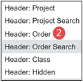
You can use Headers to load specific Projects and/or Orders into the Scheduler. Choosing a Header will divide the Scheduler with Header chosen in the top of the Scheduler, while chosen Elements will be shown in the bottom Grid at the same time.
1. Click the arrow of the Header drop down in the top menu bar

2. Choose which Header type you would like to load
You can choose how you want items to load into the Scheduler by modifying the following options:

- Jump to current time of day
- To load the Scheduler with the current date and time of day
- System Division
- To choose to see Projects and Orders for only one geographical location
- Show Shifts
- To show all the Resource Shifts associated with the Orders loaded to the Scheduler
- Highlight By
- Choose which order attribute you want Orders highlighted by on the Scheduler
- Row Sizes
- Changes the thickness of the rows of Elements populating: Small = 1 line of information, Medium = 2 Lines of Information, Tall =3 lines of information
- View - List or Tree
- Tree view will load the Generic Elements which can then be selected to reveal all specific Bookings for the chosen Element type. List View will load individual Bookings for specific Elements into the Scheduler